Onboarding & Digital Assessment Software for Homecare.
Key issue: High data repetition and on-paper documentation
My Role: I worked as a lead UX designer alongside the CEO, Care Supervisors, and Care Agency Owners/Managers leading Exploratory Research, UX and UI Design, and Remote Testing

TEAM
1
solo
TIME TAKEN
5
months

CLIENT

MyHelpa

Presenting,
Echo
featuring
Simple, smooth, and assisted onboarding

Section Repository
Status Bar
Amplified Visual
Client Statement
List of sections
Voice Notes
Time Saved
(upto 50%)
Efficient documentation (approx 30% reduction in repetetion)
Positive Valence

Background
On-paper documentation takes up 60% of the time.
Onboarding a patient into domiciliary care (home care) can take up to 3 weeks and requires multiple home visits by homecare workers. For each client, a 53 page documentation including multiple risk assessments is carefully filled out by a care supervisor. In the preliminary meetings with the CEO of MyHelpa and officials from Tamar Homecare, it was pointed that the nature of documentation requires vigilance but is also quite repetitive with nearly 600 questions to fill.
Care workers want technology that's no fuss
Care supervisors at Tamar Homecare highlighted that people working in care prefer to spend more time on care than on figuring how to handle a software. Accessibility for their staff, that is predominantly aged 60+, meant performing basic functions on a tablet without flustering or learning new features every week. Coherently, literature also highlighted that the most prevalent technology amongst care workers were video communication, text messages and health monitors.
Key requirements
-
Visible system status
-
High visibility and legibility
-
Features and interactions that support recognition and recall
-
Assisted fill
"In my experience, care workers prefer to find their own ways around tasks, like writing on the corner of their blouse sleeves" - Dr Nicholas Hine (Senior Lecturer, Computing)
On-paper practices are very common
Rostering and scheduling software's are the most common technologies used in present day Homecare. In focus group studies with Tamar Homecare, I discovered that other time-consuming parts such as risk assessments and onboarding are predominantly paper-based.
On-paper list of questions to be filled by care supervisors per client:
Pre Assessment (6-10 questions)
Initial Assessment (>212 questions)
Risk Assessment (>264 questions)
Care Plan (24 sections)
Software providers are expanding
In response to the changing market, many rostering software providers like MyHelpa are now expanding on features to cover the entire care cycle. Faced with a lack of free demos from other competitors, I shifted the focus to gather information from their customers instead.


Video calls with Tracy
Homecare system and the actors involved

Problem & Opportunity
35-40% repetition in the onboarding forms
An excessive amount of the same questions were asked under the headings of pre-assessment, initial assessment, risk assessment, and care plan. As each section demanded answers from a different standpoint, it was not effective to simply cut-down the repetition.
PROBLEM
Tedious, and repetitive on-paper documentation with low accessibility, and visibility
SOLUTION
AI assisted fill in a home care specific software with recognizable features and interactions
Business Expectations
-
Research on day-to-day issues that homecare agencies face
-
Increasing the market penetration by introducing new features for homecare management needs
-
To be white labelled by homecare agencies across the UK and the CQC (Care Quality Commission)
-
To create an MVP to be used by both public and private homecare companies
Approach
Literature review, Remote focus groups, Heuristic evaluation, and Remote Testing with the users from Tamar Homecare, UK. As part of an agile approach, the CEO of MyHelpa (stakeholder) and users (care supervisors) were involved in a periodic feedback cycle.


After : Auto enabling relevant sections based on inputs
Before : Filling all 53 pages manually

Solution
UX Targets:
-
Assisted Fill
-
Navigation matching the current on-paper system
-
Visible system status
-
Features supporting recognition
-
Accessibility
UI Targets
-
Visibility
-
Brand language
-
Accessibility
Semantic Network for AI Assisted Fill
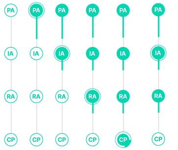
If in the pre-assessment the primary ailment for a Ms. Howarth was old age and isolation, it would mean the section of Mental Capacity, Behavioral Risk in the Initial Assessment and Recreation/Moving in Risk Assessment would be automatically enabled, as they are directly connected. The Care Plan would also automatically reflect sections of Mental Capacity and My Mobility. The same logic would allow to enable, predict and auto-fill sections based on pre trained data.

Wireframing
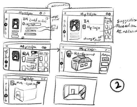
Starting right at the beginning with a care supervisor logging in, I visualized how the software would function. Training for care workers on mobile was also explored as a stakeholder interest. The final direction mutually agreed upon was a tablet based software suitable for onboarding and generating a care plan.


Key Features
Quick Overview
Patient overview with highlighted reviews per year

System Status & Shortcut
Navigation between different forms displaying status of completion

Patient Voice Notes
Invoking empathy with voice notes to boost emotional energy


Sections Top Bar
Additional medical sections to pick from

Sections side list
List view of active sections in order

Brand Language


Performance
Remote Testing
The remote test was setup with instructions on UX tweak. From a total of 10 studies, only 5 were fit for analysis. The study included a pre-test survey followed by 9 tasks on an interactive prototype, and a post-test survey.
Failure being the absence of direct or indirect success in completing a task, the task success rates were as follows:
Task 1: 66.7%
Task 2: 33.3%
Task 3: 100%
Task 4: 100%
Task 5: 33.3%
Task 6: 66.6%
Task 7: 100%
Task 8: 66.6%
Task 9: 0%
Feedback
-
Voice notes were most appreciated, followed by system status bar
-
The design of the care plan was described as “intuitive”, “straightforward”, “clear and detailed” and “adequate-could be better”
-
Three out of the five said they found it easy to add a client
-
The response to layout of the care plan was ambiguous and suggested need for changes.


Glimpses
Sections of the prototype
.png)


"I think you have done an amazing job with the detail you have and how quick you have grasped the sector. Well done!"
- Tracy Greenan, CEO, MyHelpa