
Updates
in progress !
MIIND- A UX Framework for Eliciting Joy
Brief: Consolidate case studies and build a website for MIIND, a new age UX framework in the making
My Role: I worked as a Research Assistant alongside the brains behind MIIND, Dr Rachel Siow Robertson, a philosocial anthropologist, and Dr Jennifer George, a HCI and DEI specialist.

TEAM
1
solo
TIME TAKEN
5
months

CLIENT

The Faraday Institute, Cambridge


Background
Motivation. Integrity. Intensity. Normative. Dependent (MIIND)
Reviewing the omnipresence of digital technologies, Dr Robertson, and Dr George highlight how everyday technology often drains our pleasures or promotes detrimental pleasures. Arguing that a theological and psychology-informed notion of joy can help inform goals for the design and use of digital technology, they conceive MIIND, a framework that goes on to be tested in multiple case studies [Robertson et al., 2023].
MIIND is the result of the "Building For Joy In the Digital World" project, which was funded by the NViTA group at St Andrews, Scotland.
Thinking deeper and looking for joy in digital experiences
The framework can be used in the initial stages of a digital project to evaluate scope for joy. It can also be used while building designs and while testing. Applying MIIND forces you to think beyond the traditional KPI's to look deeper and build ‘thicker’ experiences which involve deeper interactions, greater cognitive engagement, and overall flourishing.
The winning pitch
My role as a research assistant was to consolidate the case studies, and devise a structure through which MIIND can be explained and highlighted using the case studies. Moreover, following submission, the project was extended to me for website design and development.

Approach
Connecting the Dots
After extensively analysing 9 case studies on unique subjects, I started off by identifying the themes. These were informed by different elements of MIIND, however some projects had to be evaluated in retrospect as they did not actively use the framework.
User Journey
Coming soon..


Design
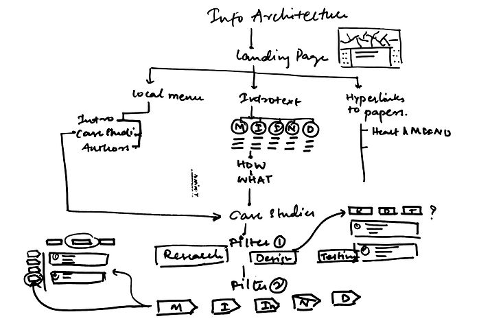
Information Architecture
The information was layered to allow for student viewers to filter the case studies by area of intervention like Research, Design, Testing. For Researchers, the architecture allowed access to detailed information on each case study, and filtering by individual facets of MIIND.
The challenge I encountered was applying a two-way filter using the WIX platform. The challenge was overcome by swapping filters for different web pages.
_1_edited.jpg)
Quick Branding
Each element of MIIND was represented by a colour. A gradient of all the colours together was used on the website edges, making sure there is no text overlap to prevent low contrast legibility.
The underlying shape used to build the logo was a star, representing the overall theme of 5 elements. The unit/ limb of the star was derived from overlapping the individual letters M, I, I, N, D (fig 2).

Figure 2: Evolution of the MIIND logo
The supporting images used were borrowed from early drawings of the brain by Santiago Ramón y Cajal, the father of Neuroscience, before imaging techniques were invented (fig 3, 4).

Figure 3: Beautiful Mind by Santiago Ramón y Cajal (public library)

Figure 4: Colour manipulated version
Each element of MIIND was represented using markers shapes and colours inspired from real-life book markers (fig 5, 6).

Figure 5: Markers

Figure 6: Markers in use on landing page
Accessibility
Coming soon..